AcquisitionProperty techLanding page
HomeAlo Signal Site
A more credible acquisition surface for a property platform, with tighter messaging and a cleaner CTA path.
Stronger first-screen trust with a more obvious user journey.
Dekhi Coder
Purrfect Software Ltd
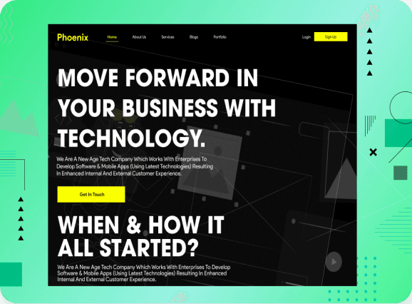
These project previews show the kind of frontend language we build: darker, clearer, more controlled, and far more premium than default agency templates.
Each card works like a compact proof section: visual tone, project story, and the outcome the design is trying to improve.
A more credible acquisition surface for a property platform, with tighter messaging and a cleaner CTA path.

A service narrative rebuilt to feel more premium, more emotionally controlled, and easier to scan section by section.

A mascot-assisted product direction that keeps the brand distinctive while still reading like a serious software interface.
These directions are intentionally structured to show message hierarchy, confidence, and control. That makes the work feel more expensive before the visitor even reads the details.
What this unlocks
A stronger bridge from homepage to work pages
Room for metrics, testimonials, and deeper proof later
More reusable case study templates as the portfolio grows